For screens & design tools
For an invitation or café name, allow room around entry and exit strokes and inspect the final mask. Start without extra tracking. Compare the exact name with Lobster rather than choosing from a single decorative capital.
Script font generator
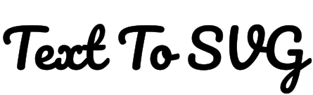
The free Pacifico font to SVG converter creates relaxed, rounded script lettering for casual wordmarks, stickers, and short social graphics. Edit the text below and export it as SVG paths or DXF with Pacifico already selected.
Fine-tune export units, fill behavior, and stroke output.
Font specimenWeekend Club / 400
Get to know the typeface
Converting the Pacifico font to SVG suits relaxed wordmarks, stickers, and short social graphics with a rounded script character. Its flowing shapes can give a name a friendly, informal voice. Use a concise phrase so the loops and connections remain easy to inspect. Long instructions and compact technical labels are usually clearer in an upright sans serif.
Inspect loops, joining strokes, and any overhangs at both ends of the actual word. A script that looks smooth at a large preview can hide a weak connection or a cramped loop at the final size. Keep room around decorative terminals and punctuation. Judge the complete word as a shape rather than assuming that separately animated letters will preserve the same rhythm.
Same text · same scale
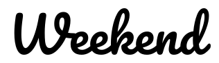
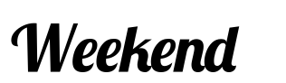
The same short word appears in Pacifico and Lobster at 400. Compare entry strokes, exit strokes, loops, and footprint. Repeat the test with the actual name because script connections depend on the letter sequence.
For this sample, Pacifico · 400 uses 13.6% more line width than Lobster · 400.
Both samples were generated from the built-in font catalog at 72 px, with kerning and standard ligatures on, zero added tracking, and no stroke. They share a coordinate scale and baseline; on small screens both shrink by the same factor. Width is the laid-out advance, including character spacing, rather than the visible outline bounds. Results apply to these font files and this text; equal weight numbers do not imply equal visual darkness. This is a layout comparison, not a readability score or a manufacturing test.
Use these as visual starting points and check your actual wording at its final size. Production limits depend on the process, material, and tool; the comparison above is not a material test.
Convert the Pacifico font to SVG using its single regular 400 cut. Keep kerning and ligatures enabled and begin with zero tracking so the intended connections are preserved. Large tracking changes can pull the word apart. To improve a small physical mark, enlarge the output or choose another typeface instead of expecting a bold version or relying on a heavy added stroke.
SVG serves design and web graphics, DXF serves compatible CAD workflows, and JSX or TSX provides outlined React components. Choose the format your destination supports.
For an invitation or café name, allow room around entry and exit strokes and inspect the final mask. Start without extra tracking. Compare the exact name with Lobster rather than choosing from a single decorative capital.
For vinyl or a cut script sign, inspect the thinnest connection between neighbouring letters. A visible join can still be an overlap that needs welding. Keep loops intact during cleanup and enlarge the word when its delicate connections cannot survive the process.
Check loops, terminals, joins, and the full viewBox at the smallest output. Keep the original word and an untouched SVG before editing or welding contours. For fabrication, inspect the thinnest connection and make a small sample before producing the finished mark.