Serif font generator

Merriweather Font to SVG Converter

The free Merriweather font to SVG converter creates grounded serif wordmarks, editorial headings, and readable fixed labels with outlined text. Edit the text below and export it as SVG paths or DXF with Merriweather already selected.

Text To SVG Options
Text To SVG Preview
Text To SVG Preview

Font specimen; the interactive preview updates after the font loads.

SVG Options

Fine-tune export units, fill behavior, and stroke output.

Text To SVG Output

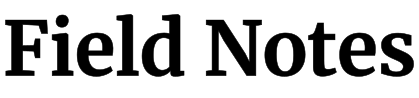
Font specimenField Notes / 700

Get to know the typeface

About Merriweather

Best use cases

  • article titles
  • bookish logos
  • quotes
  • editorial badges

Converting the Merriweather font to SVG suits editorial wordmarks, book-themed graphics, and readable serif labels. Its substantial letterforms can give a short phrase a grounded, literary character. Use it where the serif voice is part of the composition. Long paragraphs are usually better kept as real text, while very small machine-cut labels may need a simpler family with fewer projecting details.

What to look for

Inspect the serifs, small counters, and curved joins in the actual word rather than treating the letters as simple blocks. A serif extending beyond a main stem can be easy to clip in a tight composition. Compare lowercase forms and punctuation at the smallest planned size. Keep proportional scaling so the intended balance between stems and fine details remains intact.

Category
Serif
Variable font
Yes
Italic support
Yes
Available weights
300 · 400 · 500 · 600 · 700 · 800 · 900

Same text · same scale

Compare Merriweather outlines

Compare this editorial title with Playfair Display at 400. Both rows share a scale and baseline. Use the line widths for layout planning, and inspect the serif structure separately at your smallest intended size.

Sample text: The Sunday Edit

Merriweather · 400

Text width at 72 px: 569.6 px

The Sunday Edit outlined in Merriweather, weight 400

Playfair Display · 400

Text width at 72 px: 529.3 px

The Sunday Edit outlined in Playfair Display, weight 400

For this sample, Merriweather · 400 uses 7.6% more line width than Playfair Display · 400.

How this comparison was made

Both samples were generated from the built-in font catalog at 72 px, with kerning and standard ligatures on, zero added tracking, and no stroke. They share a coordinate scale and baseline; on small screens both shrink by the same factor. Width is the laid-out advance, including character spacing, rather than the visible outline bounds. Results apply to these font files and this text; equal weight numbers do not imply equal visual darkness. This is a layout comparison, not a readability score or a manufacturing test.

A starting point for Merriweather

Try in the converter
Label weight
400
Display weight
700
Letter spacing
0 to 0.01em
Curve accuracy
High

Use these as visual starting points and check your actual wording at its final size. Production limits depend on the process, material, and tool; the comparison above is not a material test.

Fine-tune the spacing

For an editorial title, convert the Merriweather font to SVG at 700, or try 400 for larger supporting labels. Keep kerning enabled and make small tracking changes; excessive spacing breaks the word into separate serif shapes. Before choosing 800 or 900 for a small output, check whether the heavier weight closes the counters. A larger size or a slightly lighter cut may preserve more of the intended detail.

Merriweather Font to SVG export guide

SVG serves design and web graphics, DXF serves compatible CAD workflows, and JSX or TSX provides outlined React components. Choose the format your destination supports.

SVG / JSX / TSX

For screens & design tools

For a book or publication title, leave room for projecting serifs and compare the line with Playfair Display. Check the actual heading width. Keep the article or description as text when it must reflow beside the fixed title artwork.

SVG / DXF

For cutting & engraving

For a literary plaque, choose a sample containing a projecting serif, a small counter, and punctuation. Check those details at the finished dimensions. Support enclosed centres separately if the design will be cut through rather than engraved.

Before you download

  • Use 700 or 900 for short SVG headings with a classic serif presence.
  • Try 300 only at large sizes where the details remain visible.
  • Pair it with Lato or Noto Sans when exporting mixed serif and sans assets.

Check serif tips, punctuation, and interior spaces at the smallest output. Leave enough viewBox room for projecting details. Record the family and weight with the source wording. For a physical piece, confirm support for counters and test the most delicate serif before cutting the whole line.

Merriweather FAQ

1

When should I use Merriweather for SVG text?

Use it for short editorial titles, book-themed graphics, and fixed labels that benefit from a readable serif character. Check lowercase, punctuation, and projecting serifs in the actual composition. Keep long article paragraphs as real text when they need ordinary reading, selection, and reflow.
2

Which Merriweather weight is best for SVG headings?

Begin with 400 for larger supporting labels and 700 for short display titles. Compare heavier cuts carefully at small sizes because counters may close before the delicate details become easier to see. Preserve the native shapes instead of thickening every edge with a stroke.
3

Should I turn a whole Merriweather article into SVG paths?

For a short masthead or final illustration, paths can preserve the selected lettering. Keep article paragraphs as real text when they need wrapping, selection, search, or translation. A long outlined paragraph will not reflow with the reading column and is harder to revise.
4

What should I check around Merriweather serifs after export?

Inspect projecting serif tips, punctuation, and lower-case joins at the final title size. Leave room around the complete path bounds instead of cropping to the main stems. Check the asset inside its destination container, where overflow rules can hide details beyond the visible box.
5

How does the Merriweather comparison with Playfair Display help?

The same title appears at 400 in both families, with a shared scale and measured line widths. Compare the serif structure and available space in your heading. It is a practical fit check for this title, not evidence that one family is always better for editorial work.
6

Can I use Merriweather for laser cutting or engraving?

Merriweather can suit engraving and printed marks when its serifs remain large enough. For through-cut lettering, inspect small serif tips, connections, and enclosed counters. Set final dimensions in the destination tool, plan support for loose centres, and make a sample with the intended material.
Merriweather Font to SVG Converter & Preview

