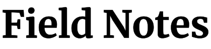
Converting the Merriweather font to SVG suits editorial wordmarks, book-themed graphics, and readable serif labels. Its substantial letterforms can give a short phrase a grounded, literary character. Use it where the serif voice is part of the composition. Long paragraphs are usually better kept as real text, while very small machine-cut labels may need a simpler family with fewer projecting details.
What to look for
Inspect the serifs, small counters, and curved joins in the actual word rather than treating the letters as simple blocks. A serif extending beyond a main stem can be easy to clip in a tight composition. Compare lowercase forms and punctuation at the smallest planned size. Keep proportional scaling so the intended balance between stems and fine details remains intact.