
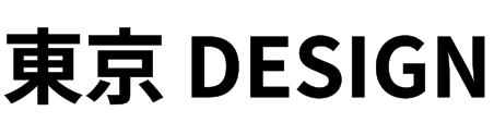
Noto Sans JP design and SVG export guide
Use this guide to evaluate Noto Sans JP beyond the live preview. It covers the font's visual behavior, spacing decisions, screen integration, and physical-production risks so the downloaded path is useful in the next step—not merely valid SVG.
Context and best-fit projects
Noto Sans JP provides a coordinated Japanese and Latin system rather than treating Japanese glyphs as an afterthought. That breadth makes it valuable for multilingual product labels, wayfinding, packaging mockups, and interface graphics. Converting a final phrase to SVG paths guarantees that the selected Japanese glyphs travel with the asset, which is useful when a vendor or design tool lacks the same font. The tradeoff is geometry: even a short Japanese phrase can contain far more path data than a Latin label.
What to inspect in the letterforms
The family uses clean, contemporary strokes and relatively even visual color across kana, kanji, numbers, and Latin letters. Full-width glyphs fill the line predictably, but their internal detail varies dramatically. A simple kana word and a phrase containing dense kanji cannot share the same minimum size. Test the actual characters, including punctuation, rather than relying on a Latin sample. At small output sizes, complex intersections may merge even when the overall word still looks balanced in a large browser preview.
Recommended starting settings for Noto Sans JP
These are practical starting points, not universal presets. Confirm them with your exact wording, final size, material, and destination.
- Label weight
- 500
- Display weight
- 700
- Letter spacing
- 0 to 0.01em
- Curve accuracy
- Medium–high
- Starting minimum
- 16 px / 5 mm
Weight and spacing strategy
Begin at 500 for interface labels and 700 for headings, signs, or compact manufacturing marks. Japanese text normally needs no added letter spacing; its full-width rhythm already creates consistent blocks. When Latin capitals sit beside Japanese, a very small spacing adjustment may help, but inspect the script boundary rather than applying one value to the whole line. Avoid ultra-light weights for path export because complex kanji can lose short strokes. Keep each line concise to control both file size and visual density.
Web, React, and screen workflow
For multilingual UI, decide whether the Japanese and Latin text should be one locked graphic or separate semantic labels. A campaign title can be one path asset; product navigation should remain live HTML whenever possible for accessibility, search, and translation. If a fixed SVG is justified, preserve a text alternative and test fallback layouts before export. Use a tight viewBox, avoid unnecessary stroke effects, and inspect the output in Figma or the target browser because large CJK paths can expose performance limits sooner than Latin text.
Laser, CNC, vinyl, and engraving
Japanese fabrication requires more than choosing a bold weight. Many kanji contain enclosed areas or short connecting strokes that can disappear after kerf, routing, engraving, or vinyl weeding. Preview in final millimetres and inspect every glyph at high zoom. For cut-through signs, plan bridges and a backing layer; for engraving, simplify tiny text rather than forcing all details into the material. Noto Sans JP is clean enough for production, but the complexity of the chosen characters—not the font name—sets the safe minimum size.
When to choose—or avoid—Noto Sans JP
Choose Noto Sans when the asset is primarily Latin and broad international consistency is enough. Roboto or Inter can create a denser Western UI tone, but neither replaces the Japanese coverage here. Noto Sans JP is weaker for expressive brush lettering, traditional editorial character, or a logo that needs a distinctive custom voice. Its strength is dependable language support. For branding, use it as the clear information layer and reserve a more individual display treatment for the primary mark.
Noto Sans JP preflight before download
Build the preview from the exact Japanese characters, punctuation, and Latin text that will ship. Compare 500 and 700, inspect the densest kanji at final size, and watch the generated file length. Do not add global spacing to repair one script boundary. Keep an accessible live-text equivalent on the web. For fabrication, measure every short stroke, identify enclosed islands, and cut a representative glyph before approving the complete phrase.